
Let’s say you want to create a Dashboard to show the current status of your Salesforce instance. Sure, you can try to use standard Reports and Dashboards for this, but what kind of fun is that? Also, let’s say some of the components you want to show aren’t available through standard reporting like Batch Execution, Apex Test failures and summarization of Login History. Login History is KIND OF available through standard reporting, but the amount of data will be so huge that using the standard report will probably not be worth it.
Ok, let’s figure out all of the things I want to see in my Admin Dashboard. I kind of alluded to some of the components above. I want to be able to see at a glance, all of the important things to my team that might tell me if there is currently a problem. Since we want this to be a bit more challenging than configuration, we are going to use High Charts which is a pretty cool library for easily embedding dynamic charts on custom pages. For the technical team, this includes:
- Apex Batch Execution by day
- Apex Test Failures by day
- Login History (Success and Failure)
- Device Activations (more on this later)
- Contact Creation
- Mysterious data point 6
Apex Batch Execution is a great metric to monitor how your batch code is running. At WatchGuard, we have so much data in some objects we need to resort to using Batches to manipulate the data in a meaningful way, as well as do data cleanup or Integration services. We are going to create a line chart to show Success and Failure.
Before we get into creating the charts, we need to worry about dates. Dates are kind of important here as we want to show trending over time, but also need to be cognizant that our data may have no data on a certain day. We need to make sure we account for this. First, we need to create some loops to generate the dates we want to use. In our case, we want to show data for a 7 day period and a 14 day period:
Date day7 = date.Today().addDays(-6);
Date day14 = date.Today().addDays(-14);
		//7 day loop
		for(Integer i=1; i<=7;i++){
			dates7Set.add(day7);
			dates7SetFormat.add(day7.format());
		    Date newDate7 = day7.addDays(1);
		    day7 = newDate7;
		}
		//14 day loop
		for(Integer i=0; i<=14;i++){                  dates14Set.add(day14);                   dates14SetFormat.add(day14.format());                   Date newDate14 = day14.addDays(1);                   day14 = newDate14;
Now that we have the list of dates we want to use, lets sort our data out. In our code, we first need to query the Batch Execution. Keep in mind, Batch Execution is only kept in Salesforce for 7 days, so you can only get data from this object for the last 7 days.
  AsyncApexJob[] jobs = [Select Id, Status, ExtendedStatus,CompletedDate,                  ApexClass.Name, MethodName                 From AsyncApexJob 				 		Where CompletedDate >= :day7
		Order By CompletedDate Asc
	        Limit :queryLimit];
Then, using this data, we will sort it into two different maps to signify success and failure.
		//Get all Async Apex Jobs, assign to Maps and add values
		Map<Date, Integer> failedList = new Map<Date, Integer>();
		Map<Date, Integer> succeedList = new Map<Date, Integer>();
		for (AsyncApexJob a : jobs) {
			currDate = date.newinstance(a.CompletedDate.year(), a.CompletedDate.month(), a.CompletedDate.day());
			if (a.Status == 'Failed') {
				if (failedList.containsKey(currDate)) {
					failedList.put(currDate, failedList.get(currDate) + 1);
				} else {
					failedList.put(currDate, 1);
				}
			} else {
				if (succeedList.containsKey(currDate)) {
					succeedList.put(currDate, succeedList.get(currDate) + 1);
				} else {
					succeedList.put(currDate, 1);
				}
			}

		}
Next, let’s take this data and apply it to our dates. Since this chart is the only one that will be over 7 days, the loop is rather easy.
		for(Date f : dates7Set){
			Integer successNum;
			Integer failNum;
			successNum = succeedList.get(f) != null ? succeedList.get(f) : 0;
			failNum = failedList.get(f) != null ? failedList.get(f) : 0;
			finalSucceedList.put(f,successNum);
			finalFailedList.put(f,failNum);
		}
Last, we need to properly format this data to be consumed by High Charts in a String format. Here are some methods that I have either written or found while trying to learn how to integrate High Charts into Visualforce (Sorry, I can’t remember exactly who to give credit to here).
	//Used to get serialized values from the related Maps to be used by Line Charts
	//See adminDashboardCompController on how to use
	global static String getMapInts(List<Integer> ints) {
		String finalSuccess = null;
		String successrecord = null;
		for (Integer s : ints) {
			successrecord = s.format();
	//High Charts cannot support numbers with commas in list
			successrecord = successrecord.replace(',', '');
			if (finalSuccess != null) {
				finalSuccess += ',' + successrecord;
			} else {
				finalSuccess = successrecord;
			}
		}
		return finalSuccess;
	}
	//Used to get serialized list of Dates to be used by Line Charts
	//See adminDashboardCompController on how to use
	global static String getValues(Set<String> strings){
		String values = null;
		for (String k : strings) {
			if (values != null) {
				values += ',\'' + k + '\'';
			} else {
				values = '\'' + k + '\'';
			}
		}
		return values;
	}
Ok, last step (kind of) to make this available for our Visualforce page. We need to pass our data to these methods to return the data in the proper format. In my case, the variables I am assigning the values to are then set to be used directly in the Visualforce page.
//Batch Apex variables
datesString = chartSerialization.getValues(dates7SetFormat);
successString = chartSerialization.getMapInts(finalSucceedList.values());
failureString = chartSerialization.getMapInts(finalFailedList.values());
Lets quickly talk about the code above. First, we set a String of dates to populate in our Line Chart. These will be used as the X-Axis values. Then we are populating two other variables to hold the serialized data for Successes and Failures. We are getting the values from another helper class called chartSerialization that holds all the methods we use for High Chart data normalization. Once the assignment is complete, we can then use the variables in our Visualforce page in our High Chart:
var batchChart = Highcharts.chart( {
			    chart: {
			    	renderTo: batches,
			        type: 'line'
			    },
			    credits: {
	                enabled: false
	            },
			    title: {
			        text: 'Apex Batch Execution Status'
			    },
			    subtitle: {
			        text: 'Past 7 days'
			    },
			    xAxis: {
			        categories: [{!datesString}]
			    },
			    yAxis: {
			        title: {
			            text: 'Number of Batches'
			        }
			    },
			    plotOptions: {
			        line: {
			            dataLabels: {
			                enabled: true,
			            },
			            enableMouseTracking: false,

			        }
			    },
			    series: [{
			        name: 'Success',
			        data: [{!successString}],
			        color: 'green'
			    }, {
			        name: 'Failure',
			        data: [{!failureString}],
			        color: 'red'
			    }]
        	});
There’s a lot going on here, so it will probably be important to read up on using High Charts so you can properly understand what all of these things do. However, you can see, we are just passing variables from our controller that hold the data for the X-Axis and the Series data for Success and Failure. Lastly, in our page, we just create a div where the id=”batches” and if we have done everything right, we will get a chart that has some data.
<div id="batches"></div>

The rest of our data, kind of follows the same format, except we just use one Series label for the charts which makes things a bit easier. Let’s review another example, Contact Creation.
In our business, Contact Creation is a good indicator of our new user registration process, where people can sign up for access on our site and use our Community to do various things. If Contact creation is at 0 for the day, thats a good indicator that something is very wrong. We want to look at this over the last 14 days to give us a good trend. Let’s look at the code.
First, query for the Contacts created over the last 14 days:
		Contact[] contacts = [Select Id, CreatedDate
					From Contact
					Where CreatedDate >=:day14
					Order By CreatedDate Asc
					Limit :queryLimit];
Then, we need to loop through the Contacts returned, put them in a Map and increment the data as Contacts are created on a certain date:
		//Contact Creation loop
		for(Contact c : contacts){
			currDate = date.newinstance(c.CreatedDate.year(), c.CreatedDate.month(), c.CreatedDate.day());
			if(!contactMap.containsKey(currDate)){
				contactMap.put(currDate,1);
			} else {
				contactMap.put(currDate,contactMap.get(currDate)+1);
			}
		}
Next, we need to loop through the list of dates over the last 14 days and either assign the values returned by the loop above, or if 0 Contacts were created, put 0:
		for(Date d : dates14Set){
			Integer num;
			num = contactMap.get(d) != null ? contactMap.get(d) : 0;
			contactFinalMap.put(d,num);
		}
Last, we need to serialize the data using the High Charts serialization methods to return the data in the proper format to be used by the Charts:
//Contact chart
contactDateString = chartSerialization.getValues(dates14SetFormat);
contactString = chartSerialization.getMapInts(contactFinalMap.values());
Then we can use this data in our Contact creation chart code:
        	var contactsChart = Highcharts.chart( {
			    chart: {
			    	renderTo: contacts,
			        type: 'line'
			    },
			    credits: {
	                enabled: false
	            },
			    title: {
			        text: 'Contact Creation'
			    },
			    subtitle: {
			        text: 'Past 14 days'
			    },
			    xAxis: {
			        categories: [{!contactDateString}]
			    },
			    yAxis: {
			        title: {
			            text: 'Number Created'
			        }
			    },
			    plotOptions: {
			        line: {
			            dataLabels: {
			                enabled: true,
			            },
			            enableMouseTracking: false,

			        }
			    },
			    series: [{
			        name: 'Created',
			        data: [{!contactString}],
			        color: 'green'
			    }]
        	});
Then reference this on the page, and you should get:
<div id="contacts"></div>

This same pattern can be used for all the other Line Charts using High Charts. You should be able to get pretty close to what you are trying to do using either pattern above. We created another chart to monitor Device Activations, which as a Product company is how our customers can use their product:

Also, using the same pattern, created a chart for Apex Test failures. This took a bit of other underlying code to store failure results after we run all tests each day through a scheduled job, but is completely do-able and another good indicator of changes to our org:

Hmm, we had 2 Test Failures today. Guess we’ve got some additional work to do over the weekend. : /
Then, we want to show Login History to make sure we can validate people are able to login or we can troubleshoot what is going on. On an average day, this can range between 30k and 60k login attempts. With this amount of data, we limited the collection to the past 24 hours and rendered the data in a Pie Chart:

Last thing I want to mention, and this is EXTREMELY important. If you run a large org, you will run into limits doing stuff like this. It will be crucial to understand how and when to use Transient to make sure the page loads and may not be limited to 50,000 records total. Viewing Login History over a single day for us can return more than 50,000 records for just a single chart. We need to think about all of the charts on the page and the View State of the page and in our case, Transient allows us to collect and display a lot more data. You may also need to add a Limit to your queries and check to see if the code is being run through a test. If it is a test, set your limit quite low as this MAY cause your tests to fail even if the page can load for a real user.
Let’s combine all the charts together and see what we get:
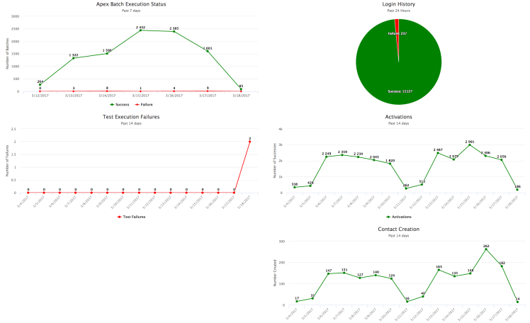
Hmm, we’re missing something in the lower left section. We will have to think about another chart to put here. As you can see, an Admin or Developer or Manager could use something like this to quickly see the health of your org. You might be able to get a lot of this data by using Event Monitoring ($$$) from Salesforce, but let’s be the cool kids and do this all ourselves.
